Do you want to invest in the best-in-class signage that represents your brand and enriches your business’s growth? Well, when it comes to great signage, design matters. However, it is not all about the colors and logos. Rather, typography plays the most vital role. It is the art of arranging letters on the sign so that it can grab attention, deliver your message clearly, and leave a lasting impression.
At SignAnt, we know that your sign is the first impression on your customers. That is why our job is not merely limited to manufacturing signs. We, as a leading sign company, also consult, design, and guide you through every step, especially when it comes to choosing the right fonts and layouts.
Let’s dive into our top typography tips for effective sign design. Also, learn how our expert team at SignAnt can help you bring it all together.
Keep It Simple and Readable
The sign at the storefront makes or breaks your brand’s image. How? Well, the customers will get a solid impact with your brand only within two seconds by reading the sign. If the sign is cluttered or the message on it is too hard to understand, people will miss it entirely.
We guide you in choosing clear and legible fonts. These work across viewing distances and lighting conditions. Our team will never let you use fancy, decorative fonts for primary messages that only require simple ones. We’ll test multiple versions and show you real-life mockups to ensure readability from various angles.
Choose the Right Font Style
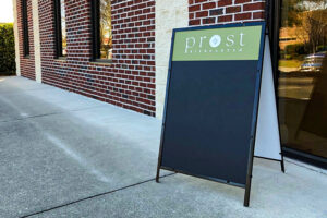
Different fonts say different things. A serif font can feel traditional or classy. A sans-serif feels modern and clean. A script font feels elegant but can be hard to read at a distance.
We start by learning about your brand personality and audience. We then help you select the best that suits both. For instance, if you are running a boutique spa, a soft and elegant font will be ideal. On the other hand, something bold, sturdy, and straightforward font will suit the storefront of your hardware shop.
We also ensure font pairings (for headers and subtext) work well together. You’d be surprised how many designs go wrong because of poor font mixing. We always avoid such issues with professional guidance.
Size Matters (A Lot)
Even a beautiful sign will not work if the font size on it is too small. Therefore, the font size should be ideal, and here comes the expertise of professional sign manufacturers and designers.
We know all the right distance-to-letter-size ratios based on industry standards. We’ll recommend minimum letter heights depending on your sign’s purpose and location. Whether you are looking for a storefront sign, sidewalk banner, or window vinyl, we will design the best typography to attract your customers.
As a general rule of thumb for sign installation:
“1 inch of letter height = 10 feet of readability”
But we go beyond rules. When you approach us for signage consultation, we simulate viewing distances with mockups. So, you can see exactly how your sign will look in real conditions.
Don’t Overcrowd Your Sign
If there are too many letters on a small sign, it will look cluttered. A cluttered sign is hard to read and makes your message less memorable.
We will strategically limit your word count according to your sign’s size. We also advise on layout spacing (also known as white space) and focus the sign’s message around what truly matters.
We’ll ask:
- What is the ONE thing you want viewers to remember?
- Is your logo taking up too much room?
- Can we break this into multiple signs or layouts?
We prioritize clarity and make sure your signage truly represents your brand.
Use High Contrast for Visibility
Maintaining the ideal contrast between the background and the text is the key to ensuring legibility of the signage. A poor contrast, like yellow text on white or light blue on gray, will make the signage difficult to read.
We apply contrast best practices to ensure your signs pop from a distance. This includes:
- Light text on dark backgrounds (or vice versa)
- Avoiding color pairings that blend together
- Making sure your font color stands out in daylight, shade, and night lighting
Materials and finishes are also crucial factors. For example, matte backgrounds reduce glare, and backlit signs enhance visibility at night.
Be Consistent with Branding
Your signs are part of your larger brand. If there are irregularities in the font sizes and layouts across multiple signs, it will hamper your brand’s trust.
We ensure your typography matches:
- Your logo
- Your website fonts
- Your print materials
We at SignAnt create a seamless and consistent look across all signs so that you can deliver your brand message through them easily.
Plan for Real-World Conditions
Even the best-designed typography fails if the material warps. Common examples of these materials warping include: the sun fades the ink, or the font is unreadable in bad weather.
We at SignAnt don’t just design. We build signs for the real world. That includes:
- Using fade-resistant inks and UV laminates
- Choosing materials that resist warping in heat or humidity
- Printing fonts at the right resolution for clarity
We also consider installation location, like whether your sign will be lit at night or placed against a complex background (like brick or glass). We adjust the design accordingly for maximum legibility and longevity.
Final Thoughts
Typography may seem like just one part of your sign. However, it can make or break your business’s impression. The font choices play a big role in whether you are trying to grab the attention of your customers or want to help find your store.
At SignAnt, we understand that great signage is a mix of art and science. Our team helps you avoid common mistakes. We design signs for maximum impact and choose typography that communicates clearly and beautifully, every time. Connect with us today to get the best signage for your brand! We have been leading manufacturers and providers of business signs. Count on us if you need customized signs or signs by tomorrow in Spartanburg, Greenville, SC, or nearby regions. We help your business stand out in the market with exceptional typography designs in every sign.
FAQs
Why should I choose the font design of a sign carefully?
Font choice affects readability, tone, and message clarity. Therefore, choosing the right font size is crucial for grabbing attention and communicating effectively at a glance.
How does font size impact sign effectiveness?
Large font size enhances the visibility. It ensures viewers quickly grasp your message without straining to read.
Should I use multiple fonts on one sign?
We suggest limiting to two complementary fonts. It helps you maintain visual harmony and avoid clutter. An ideal font size also ensures the message remains clear and focused.
What’s the ideal contrast for readable signage?
We suggest high contrast between text and background. Examples are like black on white or white on dark. It boosts readability in various lighting conditions.