Spartanburg is crowded with businesses, and they are busy competing with each other—in every possible way—sales, production, marketing, social media, digital marketing, and even signage! So, how to stand out? The first step is to create the best channel letter signs Spartanburg SC, in the town. Why? It is not just your business signage, but it is architecture with attitude, branding with electricity, and the moment your business starts sounding established, not temporary anymore!
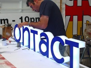
At Signant SC, we are a signage company that sees it happening countless times- when a dull storefront turns into a local landmark with the right sign on it and suddenly, the business feels bigger, more reliable, trusted, and alive. But creating the best channel letter signs is not as easy as it sounds—they are engineered to attract attention, trigger emotion, and bring business in.
It’s the Impression That Counts
The majority of people start with choosing fonts, colors, or materials—a totally wrong move. You need to think from the customer’s perspective: “What would one feel when looking at your business on a random day?” Confidence? Luxury? Speed? Comfort? Trust? Channel letter signs are not designed for reading anyway; they are for interpretation.
In Spartanburg’s commercial landscape—from the historic downtown to highways—businesses are laced with decorative signage, but emotional clarity matters more than decoration.
The best signs begin with intent, not visuals.
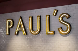
Shape is Language, not Just Structure!
Most of the time, people treat channel letters like 3D typography, but it is not 3D. Each of the letters does carry weight, proportion, and rhythm—if there is tight spacing, it feels modern and efficient; if there is wide spacing, it feels open and established. Tall, condensed forms do feel bold and urban, while rounded forms feel very approachable.
A sign is read twice—once by the eyes and second by the subconscious, where the second reading matters more, as it is where all the decisions are made. A lot of outdoor signs Greenville SC, look hygienic, clean, professional, and creative, and they attract the attention of the crowd without trying, and that is called the art of psychological positioning!
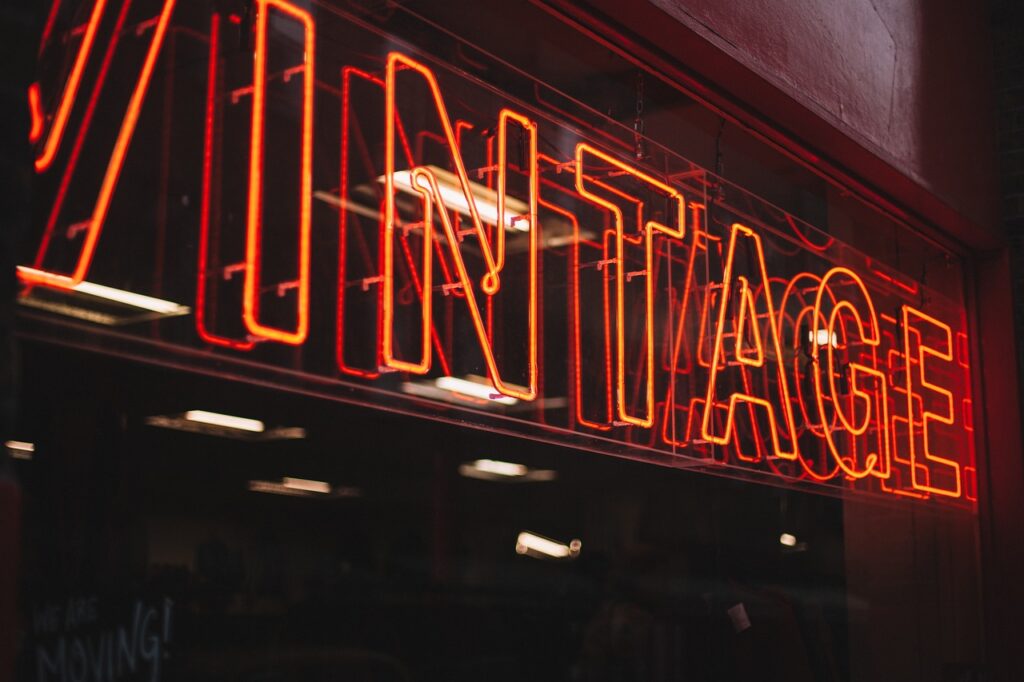
Light is not Decoration—it is Behavior Control!
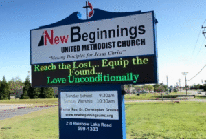
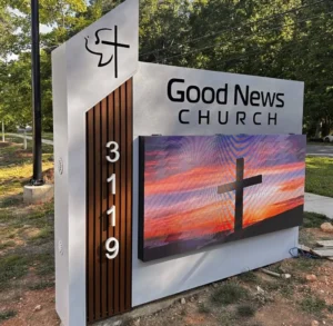
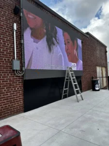
During the day, a sign is competing with buildings, trees, cars, and noise, but at night, it does compete directly with darkness. And this is where channel letters become powerful. LED illumination is not just about visibility, but it also changes how people move. A well-designed, well-lit storefront signs Spartanburg SC, attracts more traffic, increases attention span, and creates pause moments for the audience.
When your signage has this much power over your audience and business, it should be designed carefully. At Signant SC, we don’t keep lighting in the background or treat it as an afterthought, but calibrate it so the sign just doesn’t glow but guides behavior.
Spartanburg Weather will Test Everything You Build!
If you lived here, you would know about the weather—how it is harsh on outdoor signs Greenville SC. Each weather condition does affect the signage—heat expands materials, humidity tests seals, storm winds test mounting systems, and UV exposure fades low-finish materials. And this is where a lot of signs fail quietly, and with that, so does the audience’s attention.
The best channel letter signs should be built with great materials, so they last for at least five years. That means:
- Aluminum that resists corrosion instead of reacting to it
- LEDs designed for long-cycle thermal stability
- Waterproof wiring that doesn’t depend on hope
- Face materials that don’t yellow under sun exposure
Durability of your signage is not a feature of luxury, but it should be a foundation. A sign that fails visually is more of a branding issue rather than decorative.
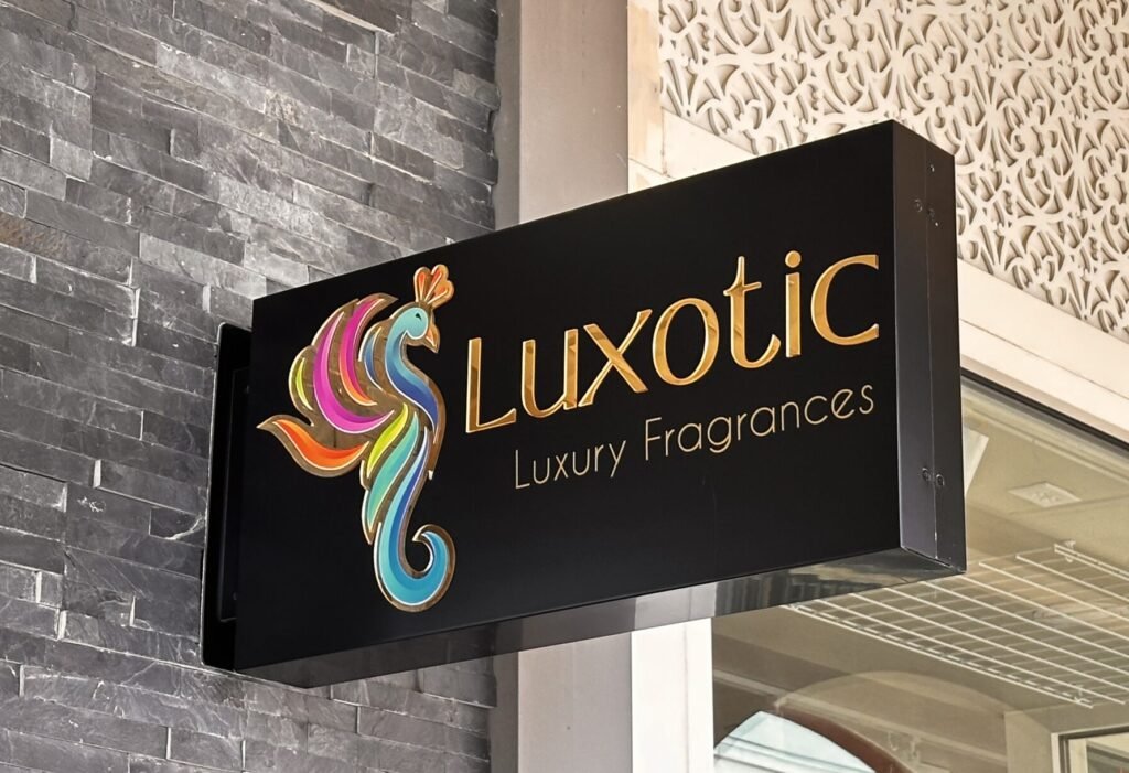
Readability Beats Creativity at a Distance!
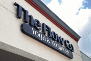
No matter how pretty your signage is, if the audience can’t read it at 40 feet, then that is not a sign but just wall art. In channel letter designs, there is a constant tension between creativity and clarity—if it is too artistic, it becomes noise, and if it is too simple, it becomes forgettable. The best storefront signs Spartanburg SC should be prioritizing readability first, brand personality second, and decorative elements last.
Another area where most business owners make mistakes is fonts—script fonts can look elegant on a logo, but not from a moving car. Similarly, overly tight kerning can turn premium branding into illegible text. In such competitive highway-facing retail zones of SC, clarity is essential.
Conclusion
Creating the best channel letter signs Spartanburg SC is not such an easy task—it is a whole transportation process of turning brand identity into a physical form. When everything goes right, a channel letter sign removes doubt—people don’t guess about your business but feel like they already know about you. That is the difference between existing signage and working signage.
And that is exactly what Signant SC builds—we create signs that speak for the business, rather than just sitting in front. When you want to create the best signage for your business, Signant SC is where you need to be!